Looking back at your preliminary task, what do you feel you have learnt in the progression from it to the full product?
When i began my preliminary task of a college magazine, i researched and analysed different conventions of a magazine. I now know that creating a music magazine involves alot more work/research in order to get it to attract your target audience. I had a clear idea of what i wanted to do for my college magazine and for my music magazine. Whilst making my college magazine i was not as familiar with Photoshop and In Design so through the process of my music magazine i found it easier to progress faster as i already had some knowledge in the creation element of the project. In my preliminary task my layout of text was quite basic and i was not adventurous. I think in my main project i was more adventurous with layout and graphology. The main image that i used i believe was a better pose than my preliminary task as it involved mise-en-scene of a guitar and also represented my target audiences social group a lot better. In my college magazine i believe that i did not utilize space to my advantage and left dead space around the page where it could have easily been filled with content. I believe that with my main project i have utilized the maximum amount of space so that i can have the maximum amount of content in my magazine. I learnt that dead space is not helpful as the readers eye will be attracted to the area of emptiness more than being attracted to the actaul stories that i am offering them. In conclusion i believe since my preliminary task i have hugely improved my creative skills with the technology i was using. My skills with tech such as In Design has greatly increased and the practice with the College Magazine helped with that alot.
Friday, 30 March 2012
In what ways does your media product us, develop or challenge forms and conventions of real media products?
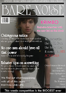
When i began my magazine project i researched many different magazine types. When thinking of what sort of magazine i was going to do i decided i was going to focus on mainly popular music in the charts so i originally planned to keep my magazine mainly colourful and bright. I soon realized it was difficult to keep my magazine looking professional whilst using colour as you can see from the example on the title of my magazine. I originally used blue for the outline around my title but then decided it looked too amateur and did not go well with the rest of the page so i decided to change it. When i was researching other magazines i noticed that alot of their models were doing a series of poses and sometimes using props such as guitars to show their style so i tried to include poses with my model so that i could completely capture his attitude and style in the way that music magazines normally do. When considering layout for my magazine i went with the most common layout for all of my pages. My front cover has a main image of a music artist and the cover lines are all aligned to the left as people usually read from left to right so this was the obvious choice. My DPS included an interview on the majority of the pages and a full sized shot of the artist to the side, this is commonly used in music magazines. I gave my contents page a simple layout and made sure i included all of the stories that i would be covering and where you could find them as any music magazine would do. I included a picture of the main feature of my magazine as i have seen other music magazine do this and it helps support.


 Here is an example of a magazine cover from Kerrang magazine and i've compared it to my own. I believe that both of our headlines for the DPS catch the readers attention, the Kerrang example uses uppercase and lowercase text whilst i have used an exclamation mark to emphasize the excitement of the article. Whilst the model is at the right of the page posing i have kept the questions and answers to the left. I decided to start on the left as it would be easier to read that way, having the image of the artist constantly there helps the reader to feel involved with them whilst reading his answers.
When i began my magazine project i researched many different magazine types. When thinking of what sort of magazine i was going to do i decided i was going to focus on mainly popular music in the charts so i originally planned to keep my magazine mainly colourful and bright. I soon realized it was difficult to keep my magazine looking professional whilst using colour as you can see from the example on the title of my magazine. I originally used blue for the outline around my title but then decided it looked too amateur and did not go well with the rest of the page so i decided to change it. When i was researching other magazines i noticed that alot of their models were doing a series of poses and sometimes using props such as guitars to show their style so i tried to include poses with my model so that i could completely capture his attitude and style in the way that music magazines normally do. When considering layout for my magazine i went with the most common layout for all of my pages. My front cover has a main image of a music artist and the cover lines are all aligned to the left as people usually read from left to right so this was the obvious choice. My DPS included an interview on the majority of the pages and a full sized shot of the artist to the side, this is commonly used in music magazines. I gave my contents page a simple layout and made sure i included all of the stories that i would be covering and where you could find them as any music magazine would do. I included a picture of the main feature of my magazine as i have seen other music magazine do this and it helps support.

As you can see here my model is posing and looking straight at the camera which is typical for music magazines. I decided i didn't want him smiling as he is a rap artist and i wanted him to present a cold expression to suggest he is a 'tough man' and has an attitude just as Eminem is doing in this picture of vibe magazine.

Here i have taken the layout of a Q contents page and compared it to my magazines contents page. We both have our contents page title at the top left of the page as it will grab the viewers attention as the first piece of text. Both of our main images on this page are of the main
feature in the magazine, this shows how huge of a feature the article is and attracts the readers attention. Our main features are the first thing on the page and are in a chronological order which allows for the reader to easily understand what in the magazine and where.


Subscribe to:
Comments (Atom)