Looking back at your preliminary task, what do you feel you have learnt in the progression from it to the full product?
When i began my preliminary task of a college magazine, i researched and analysed different conventions of a magazine. I now know that creating a music magazine involves alot more work/research in order to get it to attract your target audience. I had a clear idea of what i wanted to do for my college magazine and for my music magazine. Whilst making my college magazine i was not as familiar with Photoshop and In Design so through the process of my music magazine i found it easier to progress faster as i already had some knowledge in the creation element of the project. In my preliminary task my layout of text was quite basic and i was not adventurous. I think in my main project i was more adventurous with layout and graphology. The main image that i used i believe was a better pose than my preliminary task as it involved mise-en-scene of a guitar and also represented my target audiences social group a lot better. In my college magazine i believe that i did not utilize space to my advantage and left dead space around the page where it could have easily been filled with content. I believe that with my main project i have utilized the maximum amount of space so that i can have the maximum amount of content in my magazine. I learnt that dead space is not helpful as the readers eye will be attracted to the area of emptiness more than being attracted to the actaul stories that i am offering them. In conclusion i believe since my preliminary task i have hugely improved my creative skills with the technology i was using. My skills with tech such as In Design has greatly increased and the practice with the College Magazine helped with that alot.
Friday, 30 March 2012
In what ways does your media product us, develop or challenge forms and conventions of real media products?
When i began my magazine project i researched many different magazine types. When thinking of what sort of magazine i was going to do i decided i was going to focus on mainly popular music in the charts so i originally planned to keep my magazine mainly colourful and bright. I soon realized it was difficult to keep my magazine looking professional whilst using colour as you can see from the example on the title of my magazine. I originally used blue for the outline around my title but then decided it looked too amateur and did not go well with the rest of the page so i decided to change it. When i was researching other magazines i noticed that alot of their models were doing a series of poses and sometimes using props such as guitars to show their style so i tried to include poses with my model so that i could completely capture his attitude and style in the way that music magazines normally do. When considering layout for my magazine i went with the most common layout for all of my pages. My front cover has a main image of a music artist and the cover lines are all aligned to the left as people usually read from left to right so this was the obvious choice. My DPS included an interview on the majority of the pages and a full sized shot of the artist to the side, this is commonly used in music magazines. I gave my contents page a simple layout and made sure i included all of the stories that i would be covering and where you could find them as any music magazine would do. I included a picture of the main feature of my magazine as i have seen other music magazine do this and it helps support.


 Here is an example of a magazine cover from Kerrang magazine and i've compared it to my own. I believe that both of our headlines for the DPS catch the readers attention, the Kerrang example uses uppercase and lowercase text whilst i have used an exclamation mark to emphasize the excitement of the article. Whilst the model is at the right of the page posing i have kept the questions and answers to the left. I decided to start on the left as it would be easier to read that way, having the image of the artist constantly there helps the reader to feel involved with them whilst reading his answers.
When i began my magazine project i researched many different magazine types. When thinking of what sort of magazine i was going to do i decided i was going to focus on mainly popular music in the charts so i originally planned to keep my magazine mainly colourful and bright. I soon realized it was difficult to keep my magazine looking professional whilst using colour as you can see from the example on the title of my magazine. I originally used blue for the outline around my title but then decided it looked too amateur and did not go well with the rest of the page so i decided to change it. When i was researching other magazines i noticed that alot of their models were doing a series of poses and sometimes using props such as guitars to show their style so i tried to include poses with my model so that i could completely capture his attitude and style in the way that music magazines normally do. When considering layout for my magazine i went with the most common layout for all of my pages. My front cover has a main image of a music artist and the cover lines are all aligned to the left as people usually read from left to right so this was the obvious choice. My DPS included an interview on the majority of the pages and a full sized shot of the artist to the side, this is commonly used in music magazines. I gave my contents page a simple layout and made sure i included all of the stories that i would be covering and where you could find them as any music magazine would do. I included a picture of the main feature of my magazine as i have seen other music magazine do this and it helps support.

As you can see here my model is posing and looking straight at the camera which is typical for music magazines. I decided i didn't want him smiling as he is a rap artist and i wanted him to present a cold expression to suggest he is a 'tough man' and has an attitude just as Eminem is doing in this picture of vibe magazine.

Here i have taken the layout of a Q contents page and compared it to my magazines contents page. We both have our contents page title at the top left of the page as it will grab the viewers attention as the first piece of text. Both of our main images on this page are of the main
feature in the magazine, this shows how huge of a feature the article is and attracts the readers attention. Our main features are the first thing on the page and are in a chronological order which allows for the reader to easily understand what in the magazine and where.


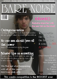
Here is the finished product for my contents page of my music magazine. I have placed the contents title at the top left of the page aswell as the date after it so it is clear to my readership what they are reader and what issue it is. I've also small printed 'Bare Noize magazine' above the magazine so it is clear in the minds of the reader and they remember what magazine has presented them with this. My main features are my first part of text on the page and it goes down in chronological page order for my readers to simply understand where they can find the articles they are interested in and a small headline about what they are. The less important articles are in a completely different box to the main features, this allows my audience to see what other things are in the magazine as not all of my readers will be interested in just the mainstream products. My main image is of my main article artist, this is to emphasize how important the article is and how interesting it is as i have allowed it to be the only image on my contents page. I am happy with the way my contents page has turned out.

This is the completed version of my double page spread. I am very happy with the way that it has turned out. I made the page colourful as i tried to present my rapper as from a dark past but coming through to be a really colourful character. By using pink on some of the letters it emphasizes the artists choice/use of colour also. I changed the word 'big' into capital letters as another form of emphasizing how much success that this artist has suddenly had and therefore want to read about him as this could happen to any average guy. By aligning all my texts to the left i have presented a simple layout which would be easy for my target audience to understand as they do not want to be wasting their time decoding a double page spread they are only interested in the content. I started the interview with an introduction and ended it with some websites about the artist. So when my readers begins to read they start to get an insight into his life and what he has been through, by the end of the interview hopefully they will want to read more and look for some extra content.
Thursday, 29 March 2012


I have decided to go with the title 'BARE NOISE' for my music magazine. Using colloquial language such as the slang term 'Bare' helps represent my magazine as with the times and 'hip'. Using these terms will help me attract my target audience as they can relate to the language that has been used. Using the word noise was an obvious choice as with the slang term bare it refers to 'alot of noise' which is was my magazine will be covering.


Here are a few of the images i have taken whilst creating my magazine. I decided i wanted to capture my model in several different poses so i was not stuck for choice in which images i would use. I had a few close up images so that i could capture the models expression through the picture but i will most likely be using full body shot images in my magazine, so that i can capture the way that he dresses and styles that he represents through the image.


Wednesday, 28 March 2012


Since i last edited my double page spread i began to place my imagine into the page. I began by opening my image into photoshop and magnetic lassoing the image so that i did not have the brick outline around my model. Once i had completed that i saved the image and placed it into in design. I also tried using multiple images to see how they looked on the page but in the end decided i would use my first idea.

 Since my last post i have altered my double page spread in various different ways in which i hope to attract my target audience. I have finally taken away the picture i had in the back round and replaced it with a completely coloured background. I liked the colour of the sky in my previous picture so i used the 'Eyedropper Tool' to replicate the shade. After i completed my background i used the pencil tool to remove some of the blue in order for me to place an image inside. I have made my pencil outline messy and uneven as i think that if it was perfect it would look boring. Therefore it wouldnt look attractive to my audience. I have finally finished my interview with the rapper and i have chosen to have the questions in Bold. This is so its easier for the reader to transition between the questions and answers without being confused. Where i have placed the messy pencil outline will be where i am going to have my main image of the rapper. I am hoping to place the image of the rapper inside the art, i know this may be difficult because of the shape.
 I started my double page spread and I began by choosing a suitable font for my magazine. I decided that because i was going to be covering pop culture music i was going to do a long elegant font which brought me to the one I chose. When i had chose the font i decided that i would use pink on some of the words to make it look edgy and give it a pop music feel. As i will be covering a rapper 'Krimbo' I decided I would try and project his image as different to other rappers who would be scared of pink. So far i have used a random image as my background as i am yet to take any pictures so this has given me a good guideline for drafting my front cover. I haven't entered any main text yet as i have been mainly focused on design elements but i will be covering an interview with the rapper and hopefully have a picture of him alongside of it.
MASTHEAD - Both have mastheads at the top of their page to draw the attention of the reader, it has been shown that when people read they start from the top. NME uses a bold and bright text in their masthead. This is to show that the magazine will have articles on 'bright and bold' music. ClassicFM uses a elegant and classic font in their masthead to show they will have articles on classic and calm music. Both magazine have mastheads, although they look different they still serve the same purpose.

COVERLINE - Both of the magazines have cover lines at the center of their page as this will be the next thing the reader see's after the masthead. NME uses the same font for the coverline as it did for the masthead. The font is tilted on its side in different ways, this is to show the edginess of the magazine and represent the music that it covers. ClassicFM also uses a similar font to its masthead, using elegant and formal fonts to represent the music it cover. Also it uses a gold colour to give to reader a feeling of elegance/importance.
MAIN IMAGE - Bother of these magazine use main images as the backround of their magazine cover although both have key differences. NME has an action shot of a man singing and playing guitar. This is because NME magazine are focused on a teenage audience and are trying to atrract people that are interested in live and exciting music. Whereas Classic Fm image is of a man calmly conducting to representant the calm classic music that the magazine will be covering.
Subscribe to:
Posts (Atom)