Thursday, 29 March 2012


I have decided to go with the title 'BARE NOISE' for my music magazine. Using colloquial language such as the slang term 'Bare' helps represent my magazine as with the times and 'hip'. Using these terms will help me attract my target audience as they can relate to the language that has been used. Using the word noise was an obvious choice as with the slang term bare it refers to 'alot of noise' which is was my magazine will be covering.


Here are a few of the images i have taken whilst creating my magazine. I decided i wanted to capture my model in several different poses so i was not stuck for choice in which images i would use. I had a few close up images so that i could capture the models expression through the picture but i will most likely be using full body shot images in my magazine, so that i can capture the way that he dresses and styles that he represents through the image.


Wednesday, 28 March 2012


Since i last edited my double page spread i began to place my imagine into the page. I began by opening my image into photoshop and magnetic lassoing the image so that i did not have the brick outline around my model. Once i had completed that i saved the image and placed it into in design. I also tried using multiple images to see how they looked on the page but in the end decided i would use my first idea.


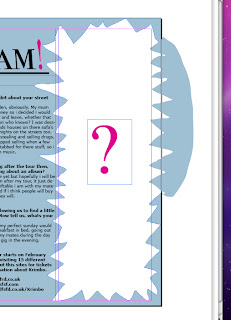
Since my last post i have altered my double page spread in various different ways in which i hope to attract my target audience. I have finally taken away the picture i had in the back round and replaced it with a completely coloured background. I liked the colour of the sky in my previous picture so i used the 'Eyedropper Tool' to replicate the shade. After i completed my background i used the pencil tool to remove some of the blue in order for me to place an image inside. I have made my pencil outline messy and uneven as i think that if it was perfect it would look boring. Therefore it wouldnt look attractive to my audience. I have finally finished my interview with the rapper and i have chosen to have the questions in Bold. This is so its easier for the reader to transition between the questions and answers without being confused. Where i have placed the messy pencil outline will be where i am going to have my main image of the rapper. I am hoping to place the image of the rapper inside the art, i know this may be difficult because of the shape.
 I started my double page spread and I began by choosing a suitable font for my magazine. I decided that because i was going to be covering pop culture music i was going to do a long elegant font which brought me to the one I chose. When i had chose the font i decided that i would use pink on some of the words to make it look edgy and give it a pop music feel. As i will be covering a rapper 'Krimbo' I decided I would try and project his image as different to other rappers who would be scared of pink. So far i have used a random image as my background as i am yet to take any pictures so this has given me a good guideline for drafting my front cover. I haven't entered any main text yet as i have been mainly focused on design elements but i will be covering an interview with the rapper and hopefully have a picture of him alongside of it.
 Here are 2 examples of music magazines. One of them is NME an popular rock and indie magazine mainly focused on a teenage to young adult audience. The other is ClassicFM magazine which is fully focused on classical music and focused mainly on an older audience normally 40+. Both magazines have different target audiences and different music types but both use the similar devices to attract their audience.

MASTHEAD - Both have mastheads at the top of their page to draw the attention of the reader, it has been shown that when people read they start from the top. NME uses a bold and bright text in their masthead. This is to show that the magazine will have articles on 'bright and bold' music. ClassicFM uses a elegant and classic font in their masthead to show they will have articles on classic and calm music. Both magazine have mastheads, although they look different they still serve the same purpose.


COVERLINE - Both of the magazines have cover lines at the center of their page as this will be the next thing the reader see's after the masthead. NME uses the same font for the coverline as it did for the masthead. The font is tilted on its side in different ways, this is to show the edginess of the magazine and represent the music that it covers. ClassicFM also uses a similar font to its masthead, using elegant and formal fonts to represent the music it cover. Also it uses a gold colour to give to reader a feeling of elegance/importance.

MAIN IMAGE - Bother of these magazine use main images as the backround of their magazine cover although both have key differences. NME has an action shot of a man singing and playing guitar. This is because NME magazine are focused on a teenage audience and are trying to atrract people that are interested in live and exciting music. Whereas Classic Fm image is of a man calmly conducting to representant the calm classic music that the magazine will be covering.

Friday, 2 December 2011


Conventions and Intentions of Music Magazine


Everyone has a view on music and it’s a formative part of growing up, so it’s no surprise that magazines on the topic have been one of the most vibrant sectors in magazine publishing. Changing trends and new bands can make or break a title.


Magazines in recent years can be categorised as:

  • Teen glossies, such as Smash Hits;
  • The 'inkies' such as Melody Maker and NME that thrived on critical rock journalism in the 1970s, so named because the ink came off the tabloid newsprint pages so easily;
  • Style bibles, a genre created by The Face, reflecting the role of music and fashion in pop culture;
  • Critical monthly glossies such as Q, MojoUncut and Word;
  • Genre-specific: Kerrang!Mixmag, Songlines and The Wire;


NME
The New Musical Express (better known as the NME) is a popular music publication in the United Kingdom, published weekly since March 1952. It started as a music newspaper, and gradually moved toward a magazine format during the 1980s, changing from newsprint in 1998. It was the first British paper to include a singles chart, in the 14 November 1952 edition. In the 1970s it became the best-selling British music newspaper. An online version of NME, NME.COM, was launched in 1996. Today NME.COM has 5 million users per month. The company that produce the magazine are IPC MEDIA.

Q Magazine

An online version of NME, NME.COM, was launched in 1996. Today NME.COM has 5 million users per month.Q was first published in October 1986, setting itself apart from much of the other music press with monthly production and higher standards of photography and printing. In the early years, the magazine was sub-titled "The modern guide to music and more". Originally it was to be called Cue (as in the sense of cueing a record, ready to play), but the name was changed so that it wouldn't be mistaken for a snooker magazine. Another reason, cited in Q's 200th edition, is that a single-letter title would be more prominent on newsstands. The company that produce the magazine are Bauer Media Group.