Friday, 30 March 2012

In what ways does your media product us, develop or challenge forms and conventions of real media products?
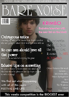
When i began my magazine project i researched many different magazine types. When thinking of what sort of magazine i was going to do i decided i was going to focus on mainly popular music in the charts so i originally planned to keep my magazine mainly colourful and bright. I soon realized it was difficult to keep my magazine looking professional whilst using colour as you can see from the example on the title of my magazine. I originally used blue for the outline around my title but then decided it looked too amateur and did not go well with the rest of the page so i decided to change it. When i was researching other magazines i noticed that alot of their models were doing a series of poses and sometimes using props such as guitars to show their style so i tried to include poses with my model so that i could completely capture his attitude and style in the way that music magazines normally do. When considering layout for my magazine i went with the most common layout for all of my pages. My front cover has a main image of a music artist and the cover lines are all aligned to the left as people usually read from left to right so this was the obvious choice. My DPS included an interview on the majority of the pages and a full sized shot of the artist to the side, this is commonly used in music magazines. I gave my contents page a simple layout and made sure i included all of the stories that i would be covering and where you could find them as any music magazine would do. I included a picture of the main feature of my magazine as i have seen other music magazine do this and it helps support.


 Here is an example of a magazine cover from Kerrang magazine and i've compared it to my own. I believe that both of our headlines for the DPS catch the readers attention, the Kerrang example uses uppercase and lowercase text whilst i have used an exclamation mark to emphasize the excitement of the article. Whilst the model is at the right of the page posing i have kept the questions and answers to the left. I decided to start on the left as it would be easier to read that way, having the image of the artist constantly there helps the reader to feel involved with them whilst reading his answers.
When i began my magazine project i researched many different magazine types. When thinking of what sort of magazine i was going to do i decided i was going to focus on mainly popular music in the charts so i originally planned to keep my magazine mainly colourful and bright. I soon realized it was difficult to keep my magazine looking professional whilst using colour as you can see from the example on the title of my magazine. I originally used blue for the outline around my title but then decided it looked too amateur and did not go well with the rest of the page so i decided to change it. When i was researching other magazines i noticed that alot of their models were doing a series of poses and sometimes using props such as guitars to show their style so i tried to include poses with my model so that i could completely capture his attitude and style in the way that music magazines normally do. When considering layout for my magazine i went with the most common layout for all of my pages. My front cover has a main image of a music artist and the cover lines are all aligned to the left as people usually read from left to right so this was the obvious choice. My DPS included an interview on the majority of the pages and a full sized shot of the artist to the side, this is commonly used in music magazines. I gave my contents page a simple layout and made sure i included all of the stories that i would be covering and where you could find them as any music magazine would do. I included a picture of the main feature of my magazine as i have seen other music magazine do this and it helps support.

As you can see here my model is posing and looking straight at the camera which is typical for music magazines. I decided i didn't want him smiling as he is a rap artist and i wanted him to present a cold expression to suggest he is a 'tough man' and has an attitude just as Eminem is doing in this picture of vibe magazine.

Here i have taken the layout of a Q contents page and compared it to my magazines contents page. We both have our contents page title at the top left of the page as it will grab the viewers attention as the first piece of text. Both of our main images on this page are of the main
feature in the magazine, this shows how huge of a feature the article is and attracts the readers attention. Our main features are the first thing on the page and are in a chronological order which allows for the reader to easily understand what in the magazine and where.


Here is the finished product for my contents page of my music magazine. I have placed the contents title at the top left of the page aswell as the date after it so it is clear to my readership what they are reader and what issue it is. I've also small printed 'Bare Noize magazine' above the magazine so it is clear in the minds of the reader and they remember what magazine has presented them with this. My main features are my first part of text on the page and it goes down in chronological page order for my readers to simply understand where they can find the articles they are interested in and a small headline about what they are. The less important articles are in a completely different box to the main features, this allows my audience to see what other things are in the magazine as not all of my readers will be interested in just the mainstream products. My main image is of my main article artist, this is to emphasize how important the article is and how interesting it is as i have allowed it to be the only image on my contents page. I am happy with the way my contents page has turned out.

This is the completed version of my double page spread. I am very happy with the way that it has turned out. I made the page colourful as i tried to present my rapper as from a dark past but coming through to be a really colourful character. By using pink on some of the letters it emphasizes the artists choice/use of colour also. I changed the word 'big' into capital letters as another form of emphasizing how much success that this artist has suddenly had and therefore want to read about him as this could happen to any average guy. By aligning all my texts to the left i have presented a simple layout which would be easy for my target audience to understand as they do not want to be wasting their time decoding a double page spread they are only interested in the content. I started the interview with an introduction and ended it with some websites about the artist. So when my readers begins to read they start to get an insight into his life and what he has been through, by the end of the interview hopefully they will want to read more and look for some extra content.
Thursday, 29 March 2012


Subscribe to:
Posts (Atom)